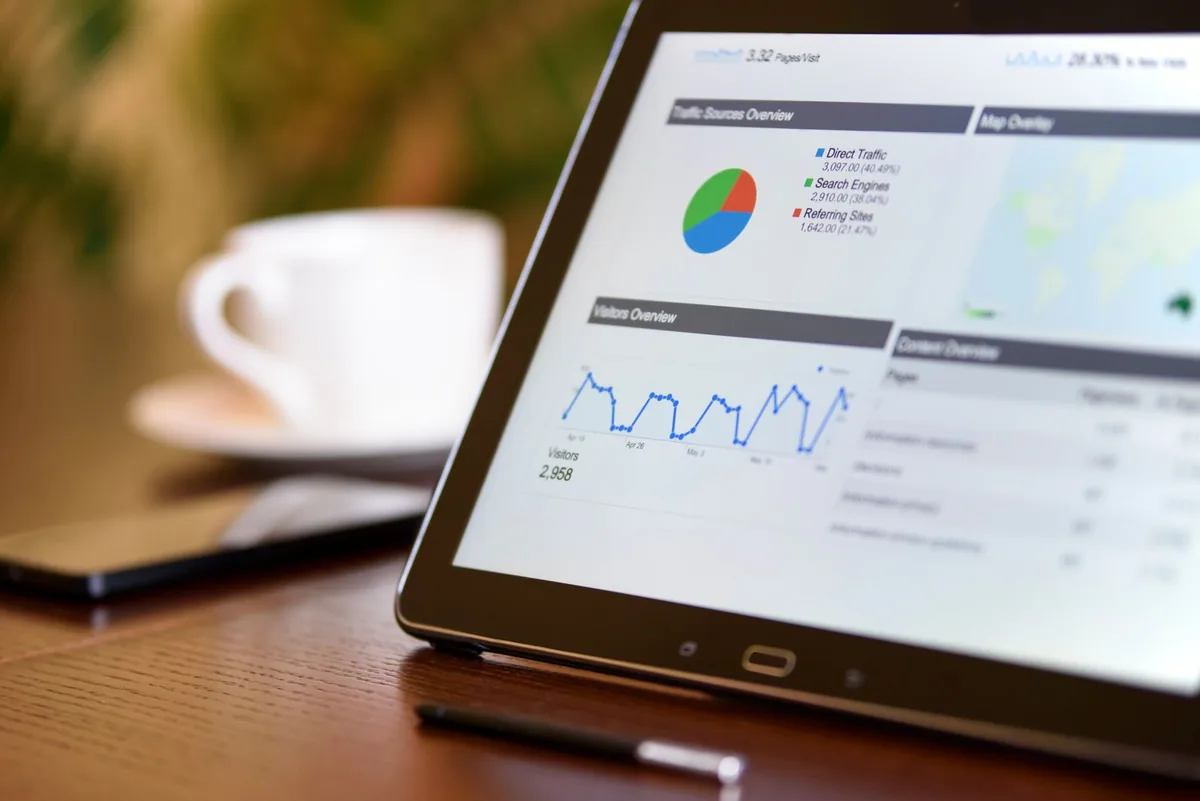
Good company dashboard design turns raw, messy data into clear answers, fast.
If you are building or improving a business dashboard, here is what works:
| What makes a dashboard effective | Why it matters |
|---|---|
| Show only the most important KPIs | Prevents information overload |
| Use clear charts and visual hierarchy | Speeds up decision-making |
| Keep layout modular and scannable | Works across roles and screen sizes |
| Apply consistent color and typography | Builds trust and reduces errors |
| Design for accessibility | Ensures everyone can use it |
82% of organizations use dashboards to monitor KPIs and business performance. And when designed well, they can cut the time it takes to find an insight by up to 50%. That is not a small gain. That is hours saved every week, across every team.
But most business dashboards fail before they are even built.
The problem is not data. Most companies have too much of it. Spreadsheets, CRM exports, ad reports, support tickets: it is all there, scattered across a dozen tools. The real problem is turning that chaos into something a person can actually act on in 30 seconds.
That is what great dashboard design solves.
Companies using data visualization tools are 28% more likely to find timely information than those relying on spreadsheets alone. The gap between a business that moves fast and one that stays stuck often comes down to how well their data is presented, not how much of it they have.
I am Kahin Warsame, founder of KWA Digital, where I have built business dashboards and reporting tools for companies that needed to stop guessing and start seeing their numbers clearly. Company dashboard design is a core part of the systems work I do: connecting your data, automating your reporting, and making it all visible in one place.
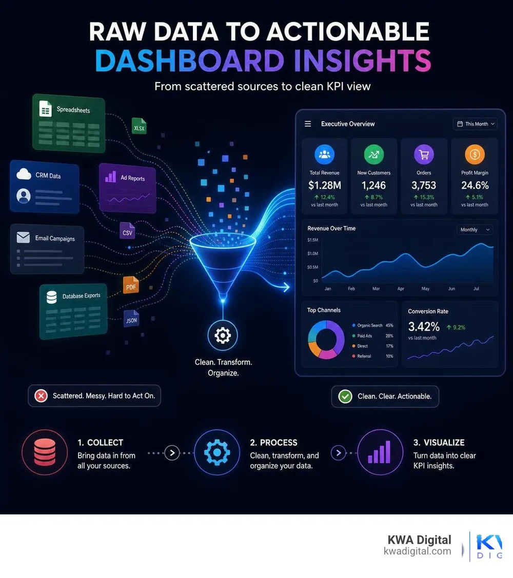
Core types of company dashboard design and their priorities
Not all dashboards are created equal. A common mistake we see is trying to build a single "everything dashboard" that serves every person in the company. When you try to please everyone, you end up with a cluttered, confusing screen that helps no one.
To design an effective dashboard, you must first understand the user persona and their specific decision-making process.
| Dashboard type | Primary audience | Key priority | Refresh rate | Common metrics |
|---|---|---|---|---|
| Executive / Strategic | C-Suite, VPs, Founders | High-level business health, long-term trends | Daily / Weekly | ARR, MRR, Net Profit, CAC |
| Operational | Department Managers, Team Leads | Real-time monitoring, daily progress, bottlenecks | Real-time / Hourly | Active support tickets, server load, daily shipments |
| Analytical | Data Analysts, Specialists | Deep-dive exploration, trend investigation | On-demand | Cohort retention, attribution, segmented behavior |
By aligning your company dashboard design with these specific categories, you ensure that the interface directly supports strategic alignment and targeted action.
Sales and revenue dashboard design
For sales and revenue teams, clarity directly translates to faster execution. A revenue-focused dashboard needs to track the sales pipeline, Monthly Recurring Revenue (MRR), and Average Revenue per User (ARPU) without forcing the user to dig through tables.
When designing these systems, we often integrate specialized ecommerce integration software to pull live sales metrics directly from platforms like Shopify or Stripe.
To see this in practice, look at this clean revenue dashboard example. It uses a collapsible sidebar and a monochromatic primary color palette to highlight MRR and active user growth metrics. By focusing on month-over-month deltas with semantic coloring (green for growth, red for warning), sales leaders can spot trends in seconds.
For teams managing active pipelines, a sales pipeline dashboard example is indispensable. It balances high-level revenue figures with paired bar charts for quarterly comparative analysis. This visual structure helps teams keep an eye on active deals while tracking fulfillment progress in a unified view.
Operational and HR dashboards
Operational dashboards focus on the "here and now." They require real-time monitoring to help teams track daily operations and solve bottlenecks as they happen. Whether you are tracking call center queue times or warehouse inventory levels, the UX must emphasize immediate actions.
In the HR space, dashboards track employee performance, recruitment pipelines, and resource allocation. Because HR and operations often span multiple business units, a single-screen layout can quickly become overwhelmed.
To solve this, we recommend a multi-page dashboard with navigation. This layout pattern uses a clean top-navigation structure with dropdowns to separate deep-dive pages (like employee records or training progress) from the main operational overview. This keeps the daily view simple while keeping secondary metrics just a click away.
Essential UI components and layout patterns
A successful dashboard layout is predictable. Users should not have to learn a new navigation system every time they open a different page.
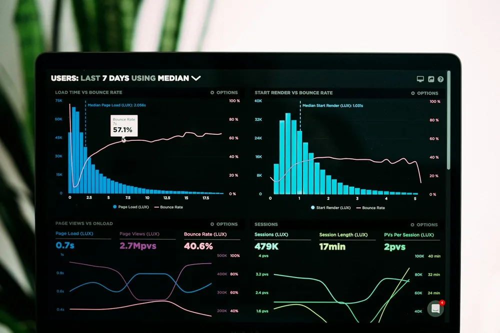
To create an intuitive, easily scannable interface, we rely on a few industry-standard UI components and layout patterns:
- Modular grid: A responsive grid that groups related data points into distinct cards. This modularity lets the dashboard adapt seamlessly to different screen sizes.
- Card-based layout: Each metric or chart lives inside its own card container with rounded corners and a subtle border. This visual separation helps the brain process one block of information at a time.
- Collapsible sidebar: A left-hand navigation menu that can collapse to maximize screen space for complex data visualizations.
- Breadcrumb header: A clear path at the top of the screen that shows users exactly where they are within the application hierarchy.
- Consistent data tables: Structured tables with status pills, avatar fallbacks for users, and clear pagination to make large datasets easy to read.
Maximizing glanceability with sparklines and KPI cards
The top of your dashboard should always feature your high-level KPI cards. These cards act as the executive summary of your screen. To make them truly effective, we combine raw numbers with trend visualization tools like sparklines.
A sparkline is a small, simplified line chart drawn without axes or coordinates. It provides immediate context about the historical trend of a metric without taking up valuable real estate.
For example, this revenue dashboard with sparklines displays high-level financial figures alongside embedded sparklines and relative timestamps. By pairing the current metric (such as "Total Sales") with a sparkline showing the last 30 days of activity, users can instantly see if a number is part of a steady climb or a sudden spike.
Balancing information density with visual clarity
One of the hardest parts of company dashboard design is finding the right balance between high-density data and visual breathing room. If you display too little data, users have to click around constantly to find what they need. If you display too much, you trigger cognitive load, leading to analysis paralysis.
To prevent this, we use the principle of progressive disclosure. This means presenting only the most critical information at first glance, while making detailed data accessible on demand (via hover states, tooltips, or click-through modal windows).
Using generous white space and a strict visual hierarchy is also essential. Grouping related items together and keeping margins consistent makes even the most complex enterprise dashboards feel light and approachable.
At KWA Digital, we believe content strategy is the secret sauce here. Designing a dashboard is not just a visual task; it requires understanding the exact words, labels, and microcopy that make data understandable. You can learn more about our approach to design and systems on our About page.
Best practices for data visualization
Choosing the right chart is critical. The wrong visualization can mislead users or make simple trends incredibly difficult to spot.
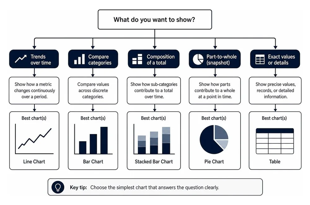
When selecting visual components for your dashboard, follow these core guidelines:
- Line charts: Best for showing continuous trends over time (for example, MRR growth or website traffic).
- Bar charts: Ideal for comparing discrete categories or showing changes across a small number of time intervals (for example, sales by product category).
- Stacked bar charts: Perfect for showing how different sub-categories contribute to a total over time.
- Donut and pie charts: Use sparingly, and only when comparing 2 to 4 segments that add up to 100% (for example, desktop vs. mobile user share).
- Scatter plots: Excellent for identifying correlations or distributions in large datasets (for example, average order value distribution).
Beyond chart selection, pay close attention to color theory and accessibility. Approximately 8% of men and 0.5% of women experience some form of colorblindness.
Avoid relying solely on red and green to communicate success or failure. Instead, pair color changes with clear icons (like checkmarks or warning triangles) and ensure your background-to-text contrast ratios meet modern accessibility standards.
Responsive design and theme modes
Modern business does not just happen at a desktop computer. Managers check performance metrics on their phones during commutes, and field teams update operational data on tablets. Your company dashboard design must adapt gracefully to any screen size.
To see how we build flexible, responsive interfaces that connect your marketing data with your operational tools, check out our work.
Designing for mobile and tablet responsiveness
Making a data-dense dashboard responsive is more complex than just stacking elements vertically. It requires thoughtful simplification.
When designing for smaller screens, we apply these key mobile-first techniques:
- Collapsible navigation: Sidebars must transform into responsive slide-out menus (often built using sheet components) that slide in from the edge of the screen.
- Adaptive charts: Complex multi-series charts should degrade gracefully into simpler visualizations, or allow horizontal scrolling to keep data readable.
- Touch targets: Interactive elements, buttons, and filter dropdowns must be at least 44x44 pixels to accommodate comfortable touch gestures.
- Prioritized content: On mobile, secondary charts are often hidden entirely, leaving only the primary KPI cards and essential action items visible.
Light mode vs. dark mode: when to use which
The choice between light and dark mode is not just about aesthetics. It has a major impact on eye strain and readability depending on the user's environment.
- Light mode: Best for analytical dashboards used during typical daylight hours in bright office environments. High-density data and small text are significantly easier to read on a light background.
- Dark mode: Ideal for real-time monitoring tools, control rooms, or SaaS applications used late at night. Dark mode reduces eye strain in low-light environments and makes bright accent colors (like neon alert indicators) pop off the screen.
Accessibility and personalization in modern dashboards
Building an inclusive dashboard means ensuring that every member of your team can access, navigate, and understand the data, regardless of their physical abilities or assistive technology needs.
Color contrast and screen reader accessibility
To achieve Web Content Accessibility Guidelines (WCAG) compliance, your dashboard must support keyboard navigation and screen readers.
This means using semantic HTML, ensuring every interactive element has a clear focus state, and adding descriptive ARIA labels to your charts and interactive widgets. A screen reader cannot interpret a canvas-based line chart without an accompanying text description or an accessible data table fallback.
Personalization and customization features
No two users have the exact same priorities. A marketing manager wants to see ad spend and conversion rates, while a product manager needs to track active feature adoption.
By introducing personalization features, you can significantly boost user engagement. Allowing users to drag and drop widgets, save custom filters, and create personalized views ensures that everyone sees the metrics most relevant to their daily work.
Furthermore, implementing role-based access control (RBAC) ensures that sensitive financial or HR data is only visible to authorized team members, keeping your business secure.
Frequently asked questions about dashboard UX
What are the latest trends in dashboard design for 2025 and 2026?
The biggest trend in 2026 is the deep integration of AI-powered insights. Dashboards are moving away from just displaying static data and are starting to offer predictive analytics and natural language summaries. Visually, we are seeing a rise in glassmorphism (frosted glass textures) and subtle 3D elements, alongside spatial context visualizations, such as overlaying IoT sensor data directly onto a 3D floor plan of a warehouse.
How do you balance data density with clean UI design?
The key is progressive disclosure. Keep the primary screen simple, highlighting only the most important 3 to 5 KPIs. Use modular cards with clear typography, and utilize hover tooltips or expandable drawers to reveal the underlying granular data when a user needs a closer look.
Why is accessibility critical for enterprise dashboards?
Accessibility ensures that your tools are usable by everyone on your team, including those with visual impairments, colorblindness, or motor limitations. Designing for accessibility is not just a legal requirement under WCAG; it also results in cleaner layouts, better color choices, and a more intuitive user experience for everyone.
Conclusion
A great dashboard is more than just a collection of charts. It is a tool that aligns your team, speeds up your decision-making, and helps you run your business with confidence.
At KWA Digital, we specialize in designing custom dashboards, websites, and connected systems that integrate your marketing and operations. Our demo-first approach means we build systems that are fully wired to your real-world data from day one, helping you turn operational chaos into clean, actionable insights.
Ready to see your numbers clearly?
Tell us what data you are drowning in, and we will design a dashboard that turns it into decisions. Demo-first, wired to your real data from day one.
Explore our services