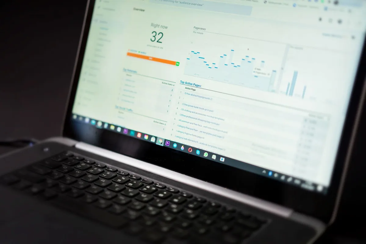
A business intelligence dashboard is a single-screen tool that pulls data from multiple sources and displays your most important metrics in charts, graphs, and KPIs, so you can make faster, smarter decisions.
Here is a quick snapshot of what you need to know:
| Question | Answer |
|---|---|
| What is it? | A visual tool that combines data from multiple sources into one interactive screen |
| How is it different from a report? | Dashboards update in near real-time and are interactive; reports are static snapshots |
| Who is it for? | Business owners, managers, analysts, and anyone who tracks performance |
| Key benefit | Makes decision-making up to 5x faster |
| Common uses | Sales tracking, financial monitoring, HR metrics, operations, marketing |
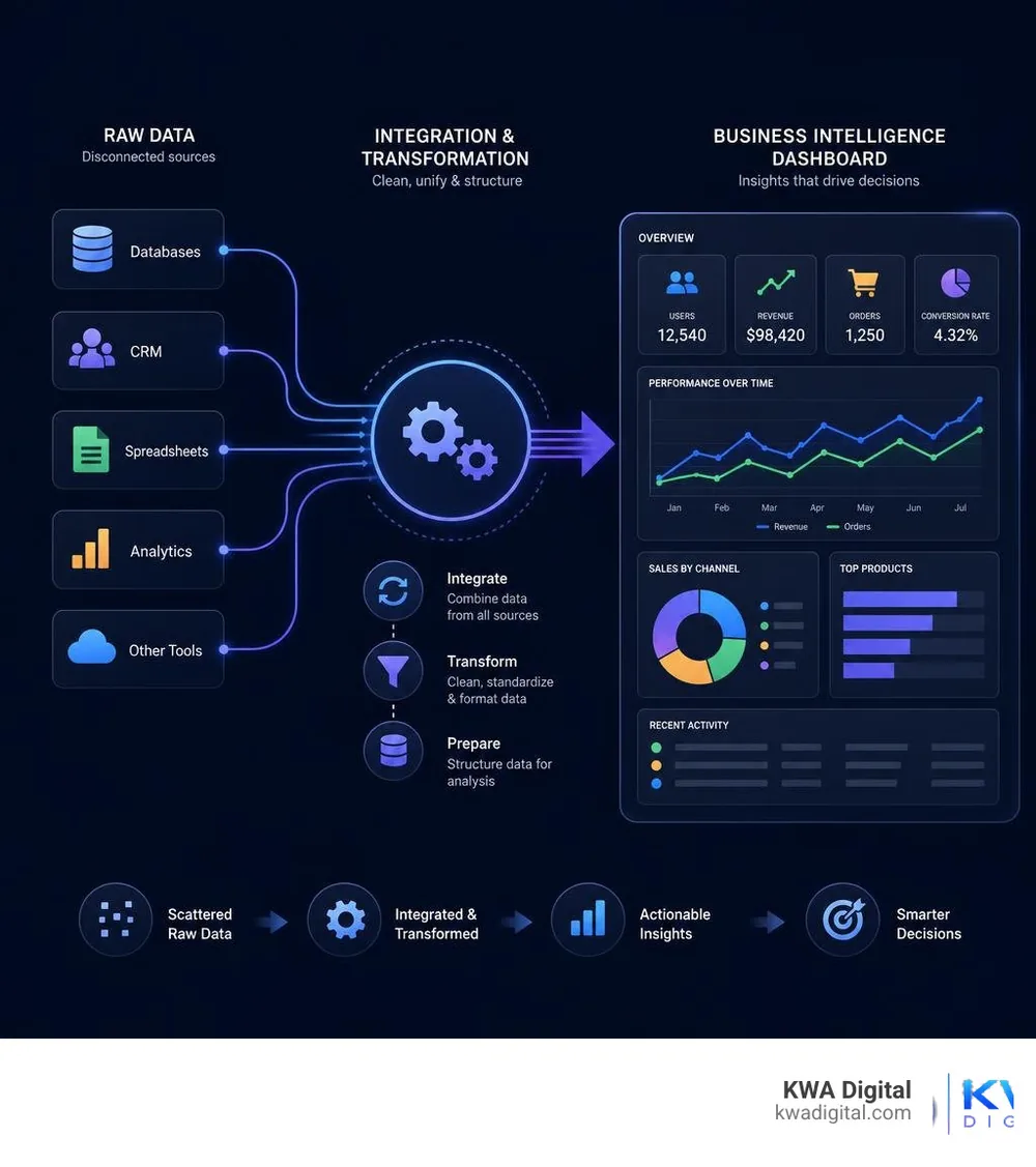
Every day, businesses generate an almost unimaginable volume of data. But raw data sitting in spreadsheets, CRMs, and disconnected tools does not help anyone. Most small business owners feel this pain directly: leads fall through the cracks, performance is hard to see at a glance, and decisions get made on gut feeling instead of facts.
That is exactly the problem a business intelligence dashboard solves. It takes all that scattered data and turns it into a clear, visual picture of how your business is actually performing, right now.
I am Kahin Warsame, founder of KWA Digital, and building business intelligence dashboards and reporting tools is a core part of the work I do helping businesses replace manual, disconnected processes with systems that actually give them visibility and control. In the sections below, I will walk you through everything you need to know, from what BI dashboards are to how to design one that works for your team.
What is a business intelligence dashboard?
At its core, a business intelligence dashboard is an information management and data visualization solution. It serves as a centralized hub that aggregates, accesses, and analyzes operational metrics and key performance indicators (KPIs) from across your entire organization. Instead of forcing you to log into five different platforms to check your marketing performance, sales pipelines, and inventory levels, it displays all of these critical data points on a single, intuitive screen.
Historically, the concept of data tracking was reserved for massive enterprises with dedicated IT departments. The earliest iterations of these tools emerged in the 1970s as "decision support systems," which eventually evolved into the "executive information systems" of the 1980s. These legacy systems were rigid, expensive, and only accessible to top-tier executives.
Today, we live in a completely different world. Modern businesses generate an astonishing 402.74 million terabytes of data every single day. In this high-velocity environment, waiting weeks for a developer to build a custom query is no longer viable. Modern BI dashboards are dynamic, highly customizable, and designed to foster a true data-driven culture where team members at every level of an organization can access and understand the metrics they need to excel.

How a BI dashboard differs from static reports
It is common to hear the terms "dashboard" and "report" used interchangeably, but in data analytics, they serve fundamentally different purposes. Understanding this distinction is crucial to building an effective business intelligence strategy.
A report is a static snapshot of historical data. It is typically structured, detailed, and multi-page, designed to offer a deep dive into a specific topic over a set timeframe (such as a monthly financial report or a quarterly sales review). Reports are excellent for compliance, auditing, and deep analytical "slicing and dicing" by data specialists. However, they are static; once a report is generated, the numbers do not change until the next manual update.
A business intelligence dashboard, on the other hand, is dynamic, visual, and interactive. It is built to provide an at-a-glance overview of your business's health in near real-time. Instead of presenting rows of numbers, a dashboard uses visual elements like gauge charts, heatmaps, and trend lines. More importantly, dashboards are built for exploration. Users can apply filters, drill down into specific data points, and change parameters on the fly without needing to write code or request a new report.
To help visualize these differences, we have mapped out how the two formats compare across key operational areas:
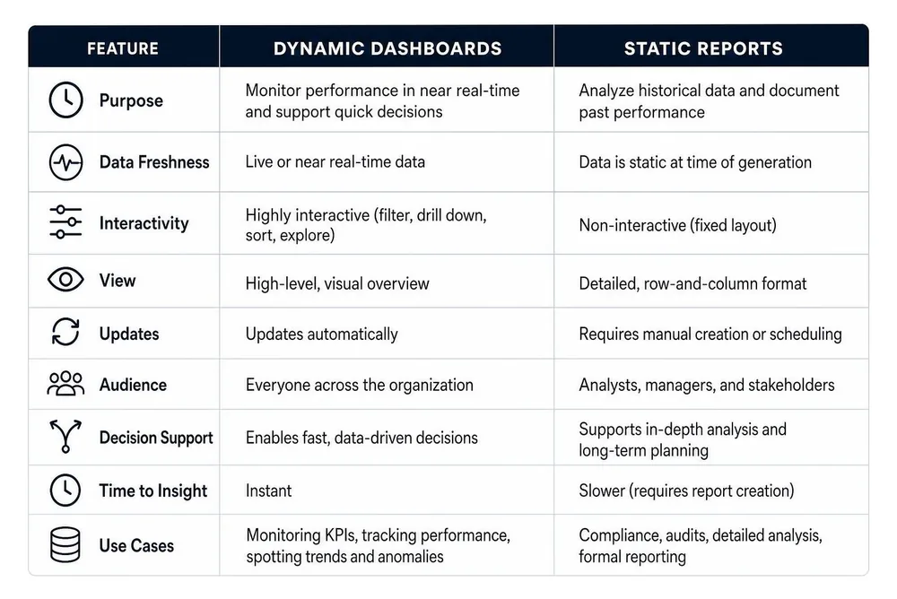
Dashboards and reports are not competitors; they are partners. A dashboard alerts you to a sudden dip in sales performance in real-time, while a detailed report helps you dig into the historical data to understand exactly why that dip occurred.
Core features and types of modern BI dashboards
Modern business intelligence tools have shifted away from the complex, code-heavy systems of the past. Today's platforms focus heavily on accessibility, flexibility, and user empowerment.

When evaluating or building a dashboard, there are several core features you should expect to see:
- Customizable visual interfaces: Users can arrange widgets, pick themes, and structure their workspace to display only the metrics most relevant to their specific role.
- Direct data source connections: Modern platforms connect directly to cloud databases, APIs, and SaaS tools, ensuring that data is pulled automatically without manual CSV exports.
- Real-time and near-real-time updates: Dashboards can auto-refresh on set cadences, ranging from daily updates to live 30-second intervals for critical operational metrics.
- Robust sharing and collaboration capabilities: Dashboards can be securely shared with team members, embedded into internal company wikis, or exported as PDFs and spreadsheets for external stakeholders.
Key components of an effective BI dashboard
To turn raw data into a narrative that drives action, a dashboard relies on a few essential components:
- Interactive filters and drill-downs: An effective dashboard does not just show you a number; it lets you ask questions. If you see a spike in customer acquisition costs, interactive filters allow you to click on that metric and drill down to see which specific marketing channels or geographic regions caused the change.
- Standard and advanced data visualizations: Visualizing data correctly is an art. Modern dashboards leverage everything from standard bar and line charts to advanced visualizations like scatter plots, box plots, histograms, and heatmaps.
- A unified semantic layer: To ensure everyone in the company is speaking the same language, modern BI tools use a governed semantic layer. This ensures that a metric like "Monthly Recurring Revenue (MRR)" is calculated exactly the same way across every single chart and department, preventing conflicting "sources of truth."
If you are looking for an agile, modern approach to data visualization, Basedash is a fantastic example of how modern BI tools are evolving. It acts as an AI-native platform that translates plain-English prompts into structured, secure database queries, making it incredibly fast for teams to build trusted dashboards without writing complex SQL.
Operational, analytical, and strategic dashboards
Not all dashboards are built for the same audience. To prevent information overload, we categorize dashboards into three primary types, each tailored to a specific business need:
- Operational dashboards (real-time monitoring): These are the "under-the-hood" monitors of your business. They track high-frequency, short-term activity and are updated in real-time or near-real-time. They are designed for front-line managers and operational teams who need to make immediate adjustments. For example, a manufacturing operational dashboard might track machine speeds and active downtime, alerting a floor supervisor to a bottleneck the moment it happens.
- Analytical dashboards (trend analysis and forecasting): These dashboards are built for data analysts and middle management. They focus on identifying trends, comparing historical data, and forecasting future performance. They do not need to update second-by-second; instead, they handle massive datasets to help teams understand the "why" behind their performance. A marketing team might use an analytical dashboard to map out customer retention cohorts over a six-month period.
- Strategic dashboards (long-term planning): Designed for executive leadership and business owners, strategic dashboards align daily operations with high-level corporate goals. They focus on long-term KPI tracking, such as year-over-year revenue growth, overall customer lifetime value (CLV), and strategic milestones. These dashboards are clean, high-level, and designed to help executives steer the company's direction without getting bogged down in daily operational noise.
Designing for success: best practices and benefits
Designing a business intelligence dashboard is a lot like designing a physical product: if it is too complicated to use, people will simply ignore it. The primary reason BI projects fail is not a lack of data, but poor user adoption driven by confusing layouts and cluttered visuals. We covered the visual side of this in depth in our guide to company dashboard design.
To build a dashboard that your team will actually love and use, we recommend following these battle-tested best practices:
- Involve end-users early and often: Do not build a dashboard in a vacuum. Sit down with the people who will use it daily. Ask them what questions they need to answer to do their jobs effectively, and design the system around those needs.
- Adopt an iterative design process: Treat your dashboard as a living product. Start with a simple prototype, test it with your team, collect feedback, and refine the visualizations over time.
- Establish a clear visual hierarchy: Place your most critical, high-level KPIs at the very top of the screen (the "executive summary" zone). Use the middle section for supporting trends and charts, and place detailed data tables or drill-down options at the bottom.
- Provide clear business context: A number without context is meaningless. If your dashboard shows that you made $50,000 in sales this week, is that good or bad? Always include comparisons, such as target goals, milestone markers, or year-over-year benchmarks, to give the data meaning.
- Avoid clutter at all costs: It is tempting to pack every single metric you track onto a single screen. Resist this urge. Too many charts, bright colors, and flashing widgets create visual noise that makes it impossible to spot critical trends. Keep it simple and focused.
When a dashboard is designed correctly, the benefits to an organization are massive. It can make your team's decision-making process up to five times faster, freeing up hours of manual reporting time. It improves overall data literacy across your organization, allowing non-technical team members to confidently interact with data.
Furthermore, having clean, visual dashboards makes it incredibly easy to "make your case" when proposing new business initiatives or presenting performance to stakeholders. If you want to see how this looks in practice, you can explore some of our real-world design work in our portfolio.
Overcoming implementation challenges and integrating data
While the benefits of a robust BI dashboard are clear, getting there requires overcoming a few common hurdles. The most frequent challenge businesses face is data quality. If your underlying data is messy, inconsistent, or full of duplicate records, your dashboard will simply visualize those errors: a classic case of "garbage in, garbage out."
To prevent this, a successful BI implementation must start with a structured data preparation phase:
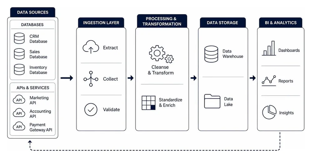
Another common challenge is system integration. Most modern businesses run on a mix of different software tools: CRMs, accounting platforms, inventory managers, and marketing suites. Pulling data from all of these separate silos into a single, cohesive dashboard can be technically challenging.
This is where picking the right tools and building a unified data architecture makes all the difference. For example, Looker Studio from Google Cloud offers a highly accessible, drag-and-drop report editor that connects directly to over 1,400 different data sources. For teams looking for advanced, department-level reporting with Google Cloud support, Data Studio Pro is available at a highly accessible price of $9 per user per project per month.
At KWA Digital, we frequently work with businesses to bridge these integration gaps. If you are running an online store, for example, connecting your storefront directly to your inventory, shipping, and financial tools is essential. We design tailored ecommerce integration software systems that ensure your operational data flows seamlessly into your BI dashboards, giving you a completely unified view of your business's health.
How AI and augmented analytics are transforming BI
As we progress through 2026, the biggest trend shaping the business intelligence space is the rapid integration of Artificial Intelligence (AI) and augmented analytics. We are moving away from the era where users had to manually build every single chart and query. Instead, AI is acting as an active partner in the data analysis process.
One of the most powerful applications of this technology is Natural Language Processing (NLP). Instead of navigating complex drop-down menus or writing SQL queries, users can simply type a question in plain English, such as "Which product category had the highest profit margin in the Midwest last quarter?", and the BI tool will automatically generate the correct chart and answer.
AI is also transforming how we prepare data. Modern platforms use machine learning algorithms to automatically clean, normalize, and prepare raw data, dramatically reducing the manual work required by IT teams. Furthermore, AI-powered systems can automatically scan your dashboards to surface hidden trends, highlight anomalies, and even provide predictive forecasting to help you anticipate market shifts before they occur.
A prime example of this evolution is Microsoft Power BI. Positioned highest for Ability to Execute and furthest for Completeness of Vision in the June 2025 Gartner Magic Quadrant for Analytics and Business Intelligence Platforms, Power BI has deeply integrated Copilot within Microsoft Fabric. This allows teams to ask questions, auto-generate executive summaries, and build entire dashboards using simple conversational prompts.
For organizations looking to adopt these enterprise-grade capabilities, Microsoft offers highly scalable pricing models. Power BI Pro is priced at $14.00 per user/month (paid yearly), while the more advanced Power BI Premium Per User is available at $24.00 per user/month (paid yearly).
Frequently asked questions about BI dashboards
What are the most common industry use cases for BI dashboards?
BI dashboards are incredibly versatile and are used across almost every major industry to streamline operations and boost revenue:
- Retail and e-commerce: Retailers use dashboards to track real-time inventory levels, monitor online shopping cart abandonment rates, analyze customer spending patterns, and optimize their supply chains to prevent stockouts.
- Healthcare: Hospitals and clinics leverage dashboards to monitor patient wait times, track bed utilization rates, analyze treatment effectiveness, and manage staffing levels based on seasonal patient volumes.
- Manufacturing: Factory managers use operational dashboards to track production line speeds, monitor equipment health (preventing costly breakdowns), and measure overall production yield and downtime.
- Financial services: Financial teams use dashboards to monitor cash flow, track investment portfolio performance, manage operational budgets, and spot unusual spending patterns that might indicate fraud.
How do you ensure data security within a shared dashboard?
Data security is a paramount concern, especially when sharing dashboards across large teams or with external partners. Modern BI platforms offer several layers of enterprise-grade security to ensure your sensitive business data remains protected:
- Role-Based Access Control (RBAC): This allows you to define exactly who can see what. For example, a sales manager might have access to the entire company's revenue dashboard, while an individual sales representative can only see the data for their specific territory.
- Row-Level Security (RLS): This filters the underlying data automatically based on the user's login credentials, ensuring that sensitive financial or personal data is never exposed to unauthorized eyes.
- SSO and SCIM integration: Modern tools integrate seamlessly with your company's existing identity management systems (like Okta or Microsoft Entra ID) to enforce secure single sign-on and automated user provisioning.
- Robust compliance standards: Leading BI tools are built to comply with global security standards, offering SOC 2 Type II compliance, end-to-end data encryption, and full audit logs to track who accessed the data and when.
Can non-technical users build their own dashboards?
Yes, absolutely! The rise of self-service BI is one of the most positive developments in modern analytics. You no longer need a degree in computer science or database administration to build a beautiful, functional dashboard.
With modern drag-and-drop canvas editors, pre-built data connectors, and intuitive templates, business users can easily assemble dashboards in an afternoon. Furthermore, the integration of conversational AI tools means that building a chart can be as simple as having a chat with an AI assistant. While some initial setup is often required to connect and clean your data sources, the day-to-day creation and customization of dashboards are fully accessible to non-technical teams.
Conclusion: let's build a system that works for you
At the end of the day, a business intelligence dashboard is more than just a collection of pretty charts. It is a tool that empowers your team, clears away operational blind spots, and gives you the exact insights you need to grow your business with confidence.
At KWA Digital, we do not believe in building static, disconnected systems. We are a founder-led digital studio, and our unique approach is a demo-first, fully connected system that seamlessly integrates your marketing data with your daily operations. We design custom websites, interactive dashboards, and smart automations specifically engineered to turn your raw traffic into measurable revenue.
If you are ready to stop guessing and start running your business with real-time, visual data, we would love to help. Explore our services to see how we can design and build a custom business intelligence dashboard tailored perfectly to your team's workflow. If you are just getting started, our guide to building a small business KPI dashboard is the practical first step.
Ready for complete visibility?
Tell us which tools your business runs on, and we will design a BI dashboard that pulls them into one clear, live picture. Demo-first, built around your workflow.
Request a free demo